What’s my least used colour family?
I’m sure some of you know.
If you answered ‘Bold Brights’ then you are correct.
Now it’s not that I don’t like the colours in Bold Brights but I much prefer Earth Elements, Rich Regals and Soft Subtles and tend to use these colours more often or a combination of them in my creations. Of course the In Colors are favourites too but I’m just talking about the regular colour families here.
So seeing I don’t often use Bold Brights but I do have them I issues myself a challenge and that was to create a card using only Bold Bright colours along with 1 neutral which was Whisper White.
I’m still unsure about these cards and would love all honest comments and/or suggestions regardless of whether you like them or not.
I had a few colours I wanted to try together so I went on over to the SU Color Combo site and selected those colours and searched for another colour. I ended up selecting 2 of the combinations that came back.
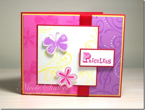
This is the first card made using Real Red, Yoyo Yellow, Pink Passion, Pixie Pink and Orchid Opulence.
I’ve used the ‘Priceless’ stamp set and ‘So Swirly’ jumbo wheel along with the white gel pen to add some highlights to the wheeled portion. The layout of this card was taken for a Mojo Monday Sketch and it is for Week 71.
For the second card I’ve used the same layout but on a standard size card, used the same stamp set but substituted Gable Green for the Orchid Opulence.
For the final card I have made so far I went with only 2 Bold Bright colours along with Whisper White and also changed the stamp set to ‘Flight of the Butterfly’.
The colours I’ve used on this next one is Real Red and Yoyo Yellow.
I’m thinking I like this one better. Even though it’s still bright I like the simplicity of the card along with just the 2 Bold Brights colours.
So what do you think? Do I do okay? Do you like one more than the others? Should I just stick with my comfort colours?


2 comments:
Nicole, I love all of these cards. I am like you and only use a "different" colour combo when pushed. It is amazing how all of these combos have come together so well. Fantastic job. Kris
I love the last one too, partly because of the colour combo and partly the design. It's a great card. I too rarely used bold brights, mainly real red!
Post a Comment