I have a few cards to show you today. I decided to CASE a card from the current Idea Book & Catalogue and then see how I could change it using different stamps but keeping the layout the same or close to. In other words I used the sketch layout for the remaining cards.
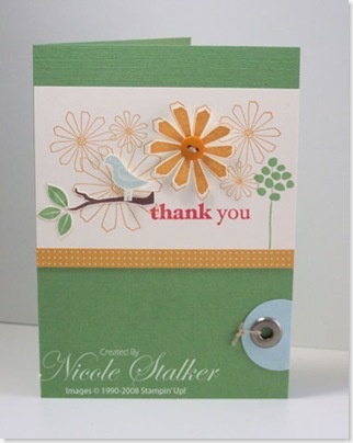
This is my card that I cased from the IB&C on page 20.
I was going to do a complete CASE but I didn't have any Old Olive Textured cardstock left so I had to use another colour combination which was chosen from the 'Mix it up with Color' list. The colours I've ended up using are Wild Wasabi, Soft Sky, More Mustard and Ruby Red. This card actually looks more time consuming that it is. I'm happy with the results. What do you think??
The colours used in the IB&C card are Old Olive, Blue Bayou, Real Red & More Mustard.
Supplies:
Stamp sets: Spring Solitude Bundle (Hostess set)
Card: Wild Wasabi textured, Soft Sky, Very Vanilla, East Coast Prep DSP
Ink: More Mustard, Wild Wasabi, Soft Sky, Ruby Red, Chocolate Chip
Accessories: Earth Elements buttons, Linen Thread, Pewter Jumbo Eyelets, Crop--dile, 1 1/4" Circle Punch, Stampin' Dimensionals, Stamp-a-ma-jig
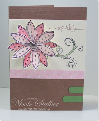
Next I decided to pull out a stamp set I haven't used in a while and that was Scribble This. The colour combination for this one is another from the 'Mix it up with Color!' combinations that Stampin' Up! supply us with when the new In Colors are released. I changed one element of the card in this layout but kept it in the same region.
You can't really tell from this picture but there is glitter over the top flower and the swirly image, hence why the word 'sparkle' is on the card. The changed element is 2 word window punches in place of the circle punch and eyelet.
Supplies:
Stamp sets: Scribble This, Warm Words
Card: Close to Cocoa textured, Wild Wasabi, Very Vanilla, Spring Fling DSP
Ink: Regal Rose, Pretty In Pink, Wild Wasabi, Close to Cocoa,Basic Black
Accessories: Word Window Punch, Pretties Kit (Rhinestone Brad), 2-way Glue Pen, Dazzling Diamonds, Stampin' Dimensionals.
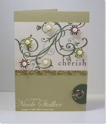
The final card (for now anyway) I've gone for something I think is a little more elegant.
I'm using the gorgeous Brocade Background DSP again so I've chosen the Baroque Motifs set this time. I love the colours in this DSP, they are just so soft and elegant looking. As you can see I've used some 1/2 back pearls to add that extra touch.
Supplies:
Stamp sets: Baroque Motifs
Card: River Rock textured, Always Artichoke, Very Vanilla, Brocade Background DSP
Ink: Always Artichoke, Old Olive, River Rock, Chocolate Chip
Accessories: 1 1/4" Circle Punch, Crop-a-dile, Pewter Jumbo Eyelet, Pretties Kit, Stampin' Dimensionals, Linen Thread, Mini Glue Dots
My personal favourites are the Spring Solitude and Baroque Motifs cards. The Scribble This looks nicer in person but I might play around with some other colour combinations on that one and see if I can create something I'm happier with. I'm sure I'll be using this sketch again too.
So, do you have a favourite??


2 comments:
these are lovely Nikki, I think I agree with your faves too (and I think it is the colour combination... it's not as unusual to me as the other two)
Great cards Nikki !!
Post a Comment