I haven't had a great deal of time lately to stamp, as you have probably gathered through my intermittent posting but last night and earlier today I managed to make 2 cards. I decided to throw a colour challenge at myself and see what I could do. I went to the SU Color Combo site, and instead of picking a colour and selecting 'search', to see what co-ordinates with that colour, I decided to leave it blank and hit 'surprise me'. I ended up selecting 6 different colour combinations and will try and make a card or item using those combinations over the next week or so.
The first 2 cards are using the 1st combination which was Very Vanilla, Bravo Burgundy, Soft Sky, Close to Cocoa and Not Quite Navy. I chose to use the Brocade Basics stamp set and see what I could create.
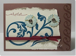
This card was my first creation. Not too sure on this one though. Maybe another layer under the Very Vanilla cardstock? Or should I have left the 'cherish' stamp off altogether? Maybe it's just the way I chose to lay out the colours? Oh well, I've now used the clear rhinestone brads from my Pretties Kit at least.
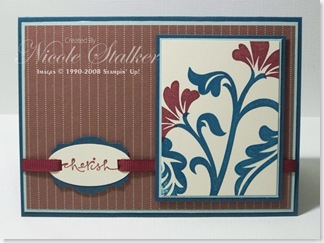
I stayed with the same stamp set for my second attempt at getting a satisfying end result from this colour combination and I must say I do like this second card much better. This time round I substituted the Close to Cocoa cardstock with some Close to Cocoa Prints designer series paper. I was also planning on using the 5/8" Bravo Burgundy Grosgrain ribbon until I went to my ribbon container and realised I hadn't ordered that one yet. Bugger.
Seeing how my birthday is coming up next week I decided to place an order for a few other items on my wishlist which includes this ribbon. Hubby only asked me yesterday what I wanted and there was nothing I could think of. If I suggested stamping stuff to him he'd only come out with 'haven't you got enough' so I don't bother suggesting and just buy something for myself.
I was going to wait until my order arrives (hopefully by the end of the week) to finish off this card, but then I decided to go another way and used the 1/4" Bravo Burgundy grosgrain ribbon instead. Oh well, I'll use the 5/8" another time.
I've stamped the word 'cherish' onto Very Vanilla and punched out using the large oval punch. This has then been mounted onto the Designer Label Punch. I had to use a retired item then (naughty me), the rectangle handheld punch, to punch the slits to thread the ribbon through. I could have used the horizontal punch but I wanted a snug fit around the ribbon.
So which do you prefer?
Why not try creating something yourself using this colour combination and post a comment with a link to your creation.


4 comments:
The second one is my fave :) I love the look of stamping off the edges like you have done on the main panel here - great job on both of them :)
I have enjoyed your blog-- you always make such nice cards! Very talented!
What beautifully classy cards Nikki. Love how you used the colour combo, particularly on your 2nd card, which is my fave. The stamping,tag & use of the prints paper look fab together. Thanks for sharing. Best wishes, Di :)
Really pretty on both accounts! I really like the first one -- I love the torn edges and those flowers!
Post a Comment