Monday, June 29, 2009

Some old, some new and some Blog Candy

Diane Barnes (a fellow Australian Demonstrator) posted a this lovely card to her blog on Friday which I just had to CASE. I also love her Bag in the same post but I didn’t need that just now.

I’m actually running late with a gift for a family member. Nothing out of the ordinary there for me unfortunately. I really need to get my act together.

After seeing Diane’s card I knew this was one of the items I wanted to make. I ended up making a set of 10 cards and matching envelopes using a combination of retired and new items. I then needed a gift box to put them all in.

This is my selection of cards:

Fresh Cuts Cards

I’ve used the Fresh-Cut Notes and envelopes to create these cards along with some polka dot print DSP in the following colours: Rose Red, Certainly Celery, Almost Amethyst, Regal Rose, Chocolate Chip, Brocade Blue, Apricot Appeal, Old Olive, Pumpkin Pie and Brilliant Blue. The papers are from the Sampler Pack II (which is a Level 1 Hostess selection in the current IB&C), Retired Prints DSP from last year or the Sampler Pack which was a promotion from last year. The lower edge was punched using the Scallop Edge punch. The buttons used are also another retired item which I have tied some crochet cotton through. Some of the cards have felt flowers from either Flower Fusions or Flower Fusions Too (both current) and those that didn’t have a coordinating felt flower I have punched a 5 petal flower from the retired Spring Bouquet Punch. The sentiment on the cards if from my favourite Level 1 Hostess set called ‘Best Yet’.I have stamped the vine image from the Fresh Cuts stamp set onto the envelopes using a coordinating colour.

Now for the gift box. Unfortunately apart from Basic Black there was no cardstock colour I could think of that would coordinate with all the colours I’ve used. Now I don’t dislike black but these cards look too soft to be placed in a black box……. Don’t you agree?? So what colour did I go for?

Rose Red & Regal Rose. How did I make my decision? That was easy. The Sweet Always DSP has a lovely polka dot print in Regal Rose. Even though it’s a smaller polka dot print to those used on the cards I still thought it fit and well I guess out of the standard colours Regal Rose is one of my favourites and definitely my favourite Pink.

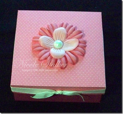
Gift Box

I haven’t done a lot to the box. I wrapped some Whisper White Taffeta Ribbon around the lid and then dyed 2 of the flowers from the Pretties Kit (1 in Rose Red and the other in Regal Rose) and then added a large 1/2 backed pearl to the centre.

Gift Box open

  Obviously this is the box open with the cards inside. I’m sure it will be warmly received. Notice I’ve put the Regal Rose one on top…lol

Now for the blog candy.

While making these cards I realised I had some brand new packs of the Sampler Packs of DSP offered in May 2008 in the Palette O’ Prints Promotion. These packs contain 48 sheets of 6” x 6” double-sided Prints Designer Series Papers. There are 4 colours in the pack: Certainly Celery, Rose Red, So Saffron and Almost Amethyst. Each colour has 12 sheets, 2 of each print.

If you would like to win a pack then just leave me a comment on this post by 6pm Sunday 5th July and you will be in with a chance. I will use Random.org to pick a winner later that evening.

This offer is open to Australian residents only who are not Stampin’ Up demonstrators. Demonstrators are welcome to leave a comment just add that you are a demonstrator so I don’t include you in the drawing please.


Happy stamping,


 photo Nikki4.png

Sunday, June 28, 2009

Faux Silk Inspiration

Last Thursday I went along to one of Marelle Taylor’s classes she put on for her demonstrators. The class was on Faux Silk and Faux Tiles. This was her technique class for June but she put an extra on for her downline.

Now I have done both these techniques in the past but it’s been a while and it’s always nice to see what others create and also to stamp with others. Marelle created a lovely card using the Faux Silk technique and the Inspired by Nature stamp set.

I won’t be showing you the actual card we made as I’m sure Marelle will share it with you soon on her blog but I came home and was inspired to make more. I needed to make some birthday cards that I’m late with and also to have some on hand for upcoming birthdays for some fellow stampers so on Friday night I made another 6 cards using the same colours Marelle chose and then decided to see what other combinations would look nice.

This is my first colour combination of Chocolate Chip, More Mustard, Kiwi Kiss, Tangerine Tango and Riding Hood Red. I also made 6 in this combination. This colour selection came from the SU Color Combos site along with the other 2 colour combinations I tried.

Inspired by Nature 4

The next colour combination is Old Olive, So Saffron, Regal Rose & Rose Red.

Inspired by Nature 5

For the final combination (I was getting a little tired of the technique by now seeing this last card was the 14th overall) I used Bravo Burgundy, Pretty In Pink, Rose Red and Certainly Celery.

Inspired by Nature 6 

Apart from changing the colours from those Marelle used I’ve also changed the sentiment. When you see Marelle’s card you will see how soft her colour combination is to those I’ve used. It is beautiful but I hope you like my choices too.

Supplies: (All 3 combined)
Stamp sets: Inspired by Nature, Sincere Salutations, Friendly Words Jumbo Wheel
Card: Chocolate Chip, More Mustard, Kiwi Kiss, Tangerine Tango, So Saffron, Regal Rose, Mellow Moss, Bravo Burgundy, Pretty in Pink, Rose Red, Certainly Celery, Whisper White
Ink: Kiwi Kiss, More Mustard, Tangerine Tango, Regal Rose, Rose Red, Old Olive, Pretty In Pink & Certainly Celery Markers, Mellow Moss, Riding Hood Red, Regal Rose, Bravo Burgundy, Kiwi Kiss & Certainly Celery inkpads
Accessories: Riding Hood Red Striped Ribbon, So Saffron Striped Ribbon, Bravo Burgundy Grosgrain, Punches: Wide Oval, Large Oval & Label, Glue Stick, Sponge Daubers, White Tissue Paper (non-SU)


Happy stamping,


 photo Nikki4.png

Sunday, June 21, 2009

Some challenges from me

This week on Stampin’ Up in Oz (an Australian Yahoo group for anyone who loves Stampin’ Up!) I uploaded a Sketch Challenge and a colour challenge for members to participate in if they wish.

I thought I’d share them on here also and if you create something using both or either then please feel free to share your creation using Mr Linky (if I’ve managed to get it to work correctly) otherwise just leave a link in the comments.

This is the Sketch Challenge:

Sketch #2

and this is the Colour Challenge:

Colour Challenge #2


This is my 1st sample. I’ve also used a new hostess set which hadn’t seen ink until now.

Live Like You Mean It 1

Supplies:
Stamp sets: Live Like You Mean It, Sanded
Card: Chocolate Chip, Mellow Moss, Pretty In Pink, Whisper White, Tea Party DSP
Ink: Pretty In Pink, Regal Rose, Mellow Moss, Chocolate Chip
Accessories: Soft Subtle Brads, Stampin’ Dimensionals, Stamp-a-ma-jig

For my second card I’ve turned the sketch on it’s side and made a small alteration. Again I’ve used both the colour and sketch together. This is also the first time I’ve used this set.

Flight of the Butterfly 1

Supplies:
Stamp sets: Flight of the Butterfly
Card: Mellow Moss, Pretty in Pink, Chocolate Chip, Whisper White, Regal Rose DSP (Hostess Pack)
Ink: Pretty In Pink, Regal Rose, Chocolate Chip
Accessories: Chocolate Chip Taffeta Ribbon, Ice Rhinestone Brad, Word Window Punch, Stamp-a-ma-jig, Stampin’ Dimensionals, White Gel Pen.


Happy stamping,


 photo Nikki4.png

Saturday, June 20, 2009

Step it Up!

Over on Marelle Taylor’s Blog she has issued a challenge for June to make a card and then ‘Step it Up!’

I needed to make a birthday card this morning for a good friend of mine and decided to not only make her a card but participate in Marelle’s challenge. My friend is receiving the ‘stepped up’ card.

I chose to use the Haiku DSP as it’s a favourite of my friend and I teamed it with the Eastern Influence stamp set. I also used a SCS sketch, SC233, which I also used for my June 2-step stamping class. I’ll share those items at a later date.

This is my original card:

Eastern Influence 2


and here is the ‘Stepped Up’ version.

Eastern Influence 3

I’ve only made a few additions of some brads and also popped up the flower.

I might yet try to step this one up even more but for now this will do.

Supplies:
Stamp sets: Eastern Influence, On Your Birthday
Card: So Saffron, Old Olive, Watercolour Paper, Haiku DSP
Ink: Stazon Black, Old Olive, So Saffron, More Mustard, Tangerine Tango, Close to Cocoa, Chocolate Chip
Accessories: Aqua Painiter, Earth Elements Brads, Stampin’ Dimensionals.


Happy stamping,
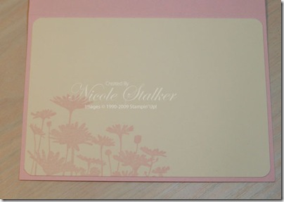

 photo Nikki4.png

Monday, June 15, 2009

Cheep Talk

I don’t tend to create a lot of ‘cute’ cards as you may have noticed and mainly use flowers in my cards. In March when demonstrators were given a few select items that we could order from the upcoming IB&C (now released IB&C) one of the sets included was Good Friends. Now I thought the bird was quite cute but seeing it was so large I didn’t think I would use it but I was hoping we’d get the smaller set called Cheep Talk in the full IB&C and of course we did. So yes I ordered it. (I also have Good Friends after using my downlines set and liking it. Surprise, Surprise…..)

At present I have a few sets on my stamp tables that I am making sure I use before going back to some others that have already seen a fair bit of ink. I’m determined not to have any uninked sets or minimally used sets in my collection from the current IB&C this time around. One of the sets on my table is Cheep Talk.

In the last couple of days in what little spare time I’ve had I’ve created 2 cards using this set.

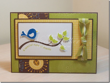
For this first card I initially chose another Splitcoast Sketch Challenge #SC229 and for colours I went with those in the Good Morning Sunshine DSP I chose to use, but as I was sitting the layers on the card to see if I liked it before adhering, I decided to change it and also add some more DSP that I initially wasn’t going to use. The end result is this.

Cheep Talk 1

and for the inside of this card I’ve added a little matching dsp

Cheep Talk 1 inside

Supplies:
Stamp sets: Cheep Talk
Card: Chocolate Chip, Whisper White, Good Morning Sunshine DSP
Ink: Kiwi Kiss, Chocolate Chip, Pacific Point, So Saffron
Accessories: Stamp-a-ma-jig, Kiwi Kiss striped grosgrain ribbon.

For card #2 I’ve used Splitcoast Sketch Challenge #SC183 and have used Windsor Knot DSP and coordinating colours.

Cheep Talk 2

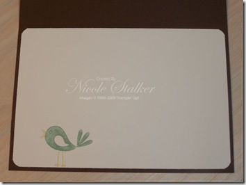
and for the inside I’ve just stamped the bird.

Cheep Talk 2 inside

Supplies:
Stamp sets: Cheep Talk
Card: Chocolate Chip, So Saffron, Sage Shadow, Whisper White, Windsor Knot DSP
Ink: Chocolate Chip, Old Olive, So Saffron, Sage Shadow
Accessories: Rhinestone Brads – Fire, Earth Elements Brads, Stamp-a-ma-jig, Paper Piercing template & tool (Tool Kit)


 photo Nikki4.png

Sunday, June 14, 2009

My sunglasses card…

I don’t mean that this card actually looks like sunglasses but you may wish to put some on before checking out the card……lol.

This is so not my colours that I would grab myself but following along from the last card in yesterday’s post I chose another Splitcoast Sketch Challenge and Colour Challenge.

The Sketch Challenge is #SC218 and I’ve teamed it with Colour Challenge #CC218. The colours for CC218 are Summer Sun, Only Orange and Kiwi Kiss. Now I looovvee Kiwi Kiss but Summer Sun and Only Orange are totally not colours I normally go for but a challenge is supposed to be just that.

I don’t totally dislike the card but as you will see it’s very different for me.

So are you ready. Do you have those sunglasses on??

Okay, here it is.

Echoes of Kindness 2

I haven’t decorated the inside yet as I’m still adjusting to the outside…

So do you see what I mean by it’s so not my normal??

Supplies:
Stamp set: Echoes of Kindness (Hostess), En Francais
Card: Summer Sun, Only Orange, Watercolor Paper, Kiwi Kiss Patterns DSP
Ink: Stazon Black, Kiwi Kiss, Summer Sun, Only Orange
Accessories: Aqua Painter, Vintage Brads, Paper Piercing template & tool (Tool Kit).


 photo Nikki4.png

Saturday, June 13, 2009

Upsy Daisy Thanks

Finally I’ve managed to allocate some time to photographing, editing and posting some more cards.

Recently I discovered Kim Badelt’s blog, thanks to Makeesha, and love the cards she creates but I especially like how she decorates the inside of the card too. It really finishes the card off nicely. I also attended one of Marelle’s classes last week and she did the same in one of her cards. I won’t share those with you yet though as it was her Stamp-A-Stack class for June so she will share them next month I’m sure and if she doesn’t show the inside I’ll post mine up then.

Today’s cards are using the Upsy Daisy stamp set and yes I’ve started decorating the inside of my cards now too.

This first card I’ve first stamped the Daisies in Baja Breeze onto Whisper White card and then I’ve stamped slightly to the right of the first image in Not Quite Navy. This gives a subtle shadow which creates a bit of depth to the image.

Upsy Daisy 4


and this is the inside

Upsy Daisy 4 inside 

I haven’t done a lot for the inside as I think the daisy image is enough on it’s own.

Supplies:
Stamp sets: Upsy Daisy, Thank You Kindly
Card: Not Quite Navy, Basic Gray, Whisper White, Urban Garden DSP
Ink: Baja Breeze, Not Quite Navy
Accessories: Stamp-a-ma-jig, Silver Hodgepodge, Corner Rounder Punch

For the second card I’ve used Stampin’ Write Markers to colour the daisies.

Upsy Daisy 5

and for the inside I’ve just stamped the daisies in Not Quite Navy.

Upsy Daisy 5 inside 

Supplies:
Stamp set: Upsy Daisy
Card: Not Quite Navy, Baja Breeze, Kiwi Kiss Patterns DSP
Ink: Kiwi Kiss, Not Quite Navy (inkpads & markers) [Kiwi Kiss marker has been made using Carol Dunstan’s tutorial]
Accessories: Stamp-a-ma-jig, Corner Rounder Punch.

For my last Upsy Daisy card I’m going to share with you today I selected a Splitcoaststampers Sketch Challenge #SC215 and then used the Splitcoaststampers Colour Challenge #CC215. The colour challenge was Pink Pirouette, Rose Red and Basic Gray. I also threw in Very Vanilla.

Upsy Daisy 6

and for the inside I’ve just stamped the daisies again but in Pink Pirouette.

Upsy Daisy 6 inside

Supplies:
Stamp set: Upsy Daisy
Card: Pink Pirouette, Basic Gray, Raspberry Tart DSP, Urban Garden DSP
Ink: Pink Pirouette, Basic Gray
Accessories: Stamp-a-ma-jig, Corner Rounder Punch.


 photo Nikki4.png

Tuesday, June 2, 2009

Inspired Thanks.

Taking a break from catty casing to show you a couple of quick cards I’ve made using the Inspired by Nature stamp set.

This first one I’ve used So Saffron, Tangerine Tango and Kiwi Kiss. I’ve inked up the stamp using sponge daubers and then very lightly spritzed with water before stamping onto Whisper White card stock. The word ‘Thanks’ is from the ‘Thank You Kindly’ stamp set (Kind Thanks stamp) and has been inked up with Tangerine Tango, stamped onto Whisper White, punched out with the small oval punch and the edges have been sponged with Kiwi Kiss using a sponge dauber.

Inspired by Nature 1

I lovely how quick and easy this card was so decided to make another using a different colour scheme. This time I’ve used Pink Pirouette, Riding Hood Red, Kiwi Kiss and Close to Cocoa.

Inspired by Nature 2

Have I mentioned before how much I’m lovin’ this years In Colors. I’m so glad they are staying around a little longer. An extra 5 months with these colours suit me just fine…….lol 

Happy stamping,


 photo Nikki4.png

Monday, June 1, 2009

Catty Casing Part 2

Today I have another 2 catty CASES and 2 of my adaptations to share with you.

This first card is using the Eastern Influence stamp set and is on page 77 in the IB&C.

Eastern Influence 1

The colours used are So Saffron, Certainly Celery, Garden Green and Very Vanilla.  This is such a pretty set and I can’t wait to play more with it.

For my adaptation I needed to increase the size of my card as I choose ‘A Rose is a Rose’ stamp set and the rose is much bigger than the one in Eastern Influence. The colour combination I went with is Pink Pirouette, Riding Hood Red, Old Olive and Basic Gray.

A Rose Is A Rose 1

I left the button off this one as it just didn’t go. Well that’s my opinion anyway.

My next catty CASE is the lovely soft card on page 114 using ‘Three Little Words’. I like the colour combination in this one and it is a reasonably simple and quick card to recreate.

Three Little Words 1

The colours used are Baja Breeze, Chocolate Chip, Pink Pirouette, Old Olive and Very Vanilla. 

Using the same layout I choose the Bloomin’ With Beauty stamp set. New sets are wonderful but we can’t neglect our carry over sets either.

Bloomin' With Beauty 1

As I was making this card I wasn’t too sure about it. I much prefer to stamp this set on Watercolour paper and use my aqua painter to colour but I wanted a Vanilla not a White. I’ve stamped onto Very Vanilla using Basic Brown ink and then coloured using my Blender Pen and Perfect Plum, Pale Plum and Kiwi Kiss inkpads. I almost stopped after mounting it onto the Chocolate Chip layer but thought once I had the base card done I’d make the decision before layering it on. I’m glad I kept going as I’m reasonably happy with the results. Might still recreate though with Watercolour paper and see how much different it looks.

Happy stamping,


 photo Nikki4.png